Barcode label design:
common errors
how to avoid them
SageData is based in Ottawa, Ontario, Canada
When people move from a paper based (or spreadsheet based) system to a full
fledged asset management or warehouse management system, they invest in software,
hardware..... and labels.
The Labels are often the least expensive item on that list, but they often attract
the most attention, and sometimes elemental mistakes in the desgin of the label can
degrade the effectiveness of the whole system. Here we talk about how to design a barcode
label, and describe some of the common errors, and how to avoid them.
#1 You don't have to buy a printer
Many of our clients are using our systems for asset management, for
equipment inspections, to track the issue and return of tools / weapons and other
applications. For these applications you do not need a printer. Barcode printers are
expensive to buy, tricky to set up, inherently prone to failure (because of all the
moving mechanical parts), they need software, and you have to design the labels.
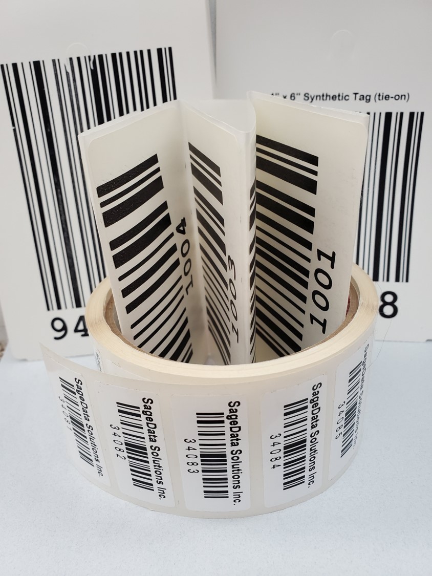
So what is the alternative? Buy labels pre-printed. We offer labels to your specification.
#2 Print black stripes on a white background
One of the most frequent questions we have is "do barcodes have to be
printed on a white background". The short answer is yes. The longer answer is that you
may be able to get away with printing on other colors, but it is unreliable.
We have had cases where labels on textured backgrounds worked well with some readers, but
rendered other readers blind
. So this becomes a solution of last resort. Click here to read more
about barcode label colors and backgrounds .
Our advice is talk to us or to another competent vendor.
#3 Use Code 128C - and an even number of characters
Many systems still use Code 39 as a symbology. But Code 128 has a smaller footprint, has more error checking,and can handle the full range of ascii characters. If you want to go for perfectionism, limit the ID you are encoding to numeric, and keep an even number of characters. This will enable the barcode to be printed using Code 128C, which is even more compact and easier to read.
#4 Barcodes need room, and a quiet place
One of the most common errors that can render a barcode unreadable, or
worse, intermittently readable, is lack of quiet space.
A barcode reader operates by distinguishing the white spaces from the black bars. But it
needs to understand what white is. So it calibrates itself with the white space on either
side of the bars. A common error is to print to the edge of the label. The read then
becomes unreliable.
Two real life examples: labels which read when placed on a white cabinet, but not
when placed on a black cabinet, and the executive who trimmed the white space on each
side of the barcodes on his office equipment, to make them look nicer
.
#5 Use 2D barcode for the smallest labels
A 2D barcode label can be very small. We have helped one of our clients with
tiny, less than 4 x 4mm labels containing 4 alphanumeric characters.
There is another advantage that 2D barcode offers - it can be scanned / read in any
direction. Therefore, if small hardware pieces are labeled with tiny 2D barcodes, they
could be scanned without specific orientation as long as the code is visible.
If you found this useful, you might also want to review:
- an introduction
to barcode technology
- 1D or 2D
barcodes?
- mobile data
collectors
- consulting
services: barcodes and their applications
QAOK3168